bespoke-theme-beachday
A Bespoke.js theme by Flávio Coutinho
Script
Supported plugins
- List of plugins we have styling for
- Example of bespoke-state
Supported plugins (1/2)
The following plugins have rules regarding their styling:
- bespoke-progress
- Progress bar at the top (+slide number)
- For slide numbers, use fegemo's branch (
github:fegemo/bespoke-progress#slide-numberonpackage.json) - bespoke-bullets
- Shows a slide part (
.bespoke-bullet) by part with sliding animation - bespoke-scale
- Properly scales to fit the screen
- For improved performance, use fegemo's branch (
github:fegemo/bespoke-progress#use-current-slideonpackage.json)
Supported plugins (2/2)
These plugins too have rules regarding their styling:
- bespoke-search
- Allows Ctrl-Fing into the presentation
- bespoke-backdrop
- Styles slide backgrounds
- bespoke-simple-overview
- Shows zoomed out slides when hit ESC
- bespoke-state
- Styles the "emphatic" and "show-active-slide-and-previous" states
Using the bespoke-state plugin
With a data-bespoke-state="STHG", We can add different effects:
emphatic- Makes the whole presentation have an impactful color
show-active-slide-and-previous- Shows the previous and the current slide together
Slide transitions
slidingsubtletransition-giant-wheeltransition-grow
Sliding 1/3
.transition-sliding on the slide
Sliding 2/3
.transition-sliding on the slide
Sliding 3/3
.transition-sliding on the slide
Subtle 1/3
.transition-subtle on the slide
Subtle 2/3
.transition-subtle on the slide
Subtle 3/3
.transition-subtle on the slide
Giant Wheel 1/3
.transition-giant-wheel on the slide
Giant Wheel 2/3
.transition-giant-wheel on the slide
Giant Wheel 3/3
.transition-giant-wheel on the slide
Grow 1/3
.transition-grow on the slide
Grow 2/3
.transition-grow on the slide
Grow 3/3
.transition-grow on the slide
Layouts
This is a .layout-section-header slide
- layout options
- There are several slide layouts available
- instructions
- It requires a
<h1>,<h2>and something else with a.content
Regular layout
To specify the slide's layout, add a class in the form .layout-NAME, such as .layout-section-header.
If a layout is not specified (we called it a regular slide), it looks like this one. It is just a vertical flex, no mistery.
Strongs are styled with an accent color, but can also use an .alternate-color.
Centered layout
If you like things centered, you can make it vertically centered (.layout-centered-vertical), horizontally (.layout-centered-horizontal - this one) or in both directions (.layout-centered).
The .layout-centered is a flexbox with:
justify-content: center
align-items: center
A centered layout (even the horizontal) does not center-align the text. To do so, add a .text-centered to the slide or element.
A title slide
Just a .layout-title with an <h1> and an <h2>
Title + 2 Columns
- This slide uses a
.layout-2-column-contentlayout - It splits content in 2 equal halfs using a grid
- And it also requires a title before the split content
- There is also
.layout-3-column-contentand.layout-4-column-contentlayouts - If you want an element to span all columns, use
.span-columns - The following code illustrates this slide's content:
<h1>Layout: .layout-column-content</h1>
<ul>...</ul>
<ol>...</ol>
<pre class="span-columns"><code>...</code></pre>
Slide with a highlight
- This is yet another layout
- It's called
.layout-2-column-highlight-and-content - And it expects a title (
h1..6), one highlighted element as the second child of the slide and any other content (ul, ol, dl, p, whatever)
One code
This is a layout that
allows 3 elements to
split the slide width
equally.
Two codes
Might be useful for
showing different
code files, for
example, as it allows
the code elements to
expand to full width
when hovered.
Three codes
This is called the
layout
.layout-3-column-element-with-titles-expansible
and it expects three
sequences of a title
(h1..6) and another
element (e.g., a <pre>)
Circling balloons layout
This is the
.layout-circling-balloonslayout.It expects a title (
h1..6) and a list (ul) of 3 elementsEach list item can have a image (as an icon) and other elements, which are shown upon hovering
Tall figure + content

- This uses the layout
.layout-tall-figure-left - It expects a title (h1..h6), strong>something tall to be put to the left and some content to the right
- There is also
.layout-tall-figure-rightwhich puts the figure to the right
Definition List
This is a .layout-centered slide
- Term 1
- It means this or that
- Term 2
- I really mean that it means it
- Term 3
- Can a canner can a can?
.layout-main-point Slide
Emphatic Slide
Typography
Styling of basic elements
- Text
- Code
- Lists
- Tables
Text
Font-wise, titles use Amatic SC and body text use Source Code Pro.
BTW, ⬆️ shows styling for <strong> and <a> elements.
You can add .alternate-color to strongs too.
It is possible to quote in block:
Hey, someone else said this!Not me
The code was just:
<blockquote>
  Hey, someone else said this!
  <cite>Not me</cite>
</blockquote>
Source code
Inline code just needs a <code>content here</code> element.
Multiline code should go inside a <pre> with a <code> inside.
<pre><code>function delta(a, b, c) {
  return b**2 - 4*a*c
}</code></pre>
You can also add keyboard keys using <kbd>keys</kbd>.
Lists
The three types of HTML lists are stylized:
See an unordered list
- item 1
- item 2
- item 3
Now an ordered list
- item 1
- item 2
- item 3
And a definition list
dl- is a definition list
dt- is a data term
dd- is a data definition
Tables
Some nice looking styles for tables:
| Person identification | Grade | |
|---|---|---|
| 2005046102 | Epaminondas | 10 |
| 2004021102 | Pocahont | 9 |
| 2009126725 | Eliete | 8 |
| 2041941837 | Judicious | 9 |
| Average | 9 | |
And some classes:
Utility classes
Useful ready-to-use styles
- Positioning and sizing
- Slides and images
- Environments
- Buttons, switches and badges
- Lists
- Layout
Positioning and sizing (1/3)
.push-{left,right}- Floats element to the left or right
.push-code-{left,right}- Floats the
pres inside .flex-align-center- Centralizes element (inside a flex)
.flex-align-start- Aligns an element left
.flex-align-end- Aligns an elemnt right
.centered- Automatic horizontal margins (and block)
.center-aligned- Center-aligns inline content
Positioning and sizing (2/3)
.contain- Makes max dimensions to be 100%
.half-width- Applies 50% width
.three-quarter-width- Applies 75% width
.full-width-slides- Applies 100% max-width
.emoji- Emoji inside the text
.on-line- Something to appear inline (h: 1em)
.no-margin- Removes any margin
.no-padding- Removes any padding
Positioning and sizing (3/3)
.full-width- Applies 100% width
.full-width- Applies 80% width
.large-width- Applies 60% width
.medium-width- Applies 40% width
.small-width- Applies 20% width
.full-height- Applies 100% height
.huge-height- Applies 80% height
.large-height- Applies 60% height
.medium-height- Applies 40% height
.small-height- Applies 20% height
.block- Makes the image block
Slides and images
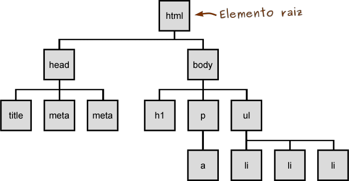
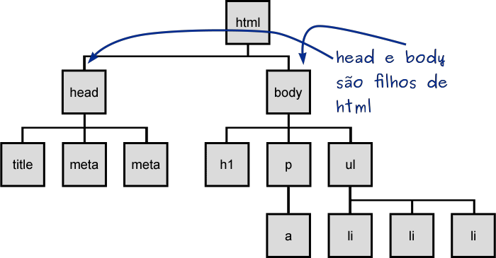
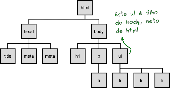
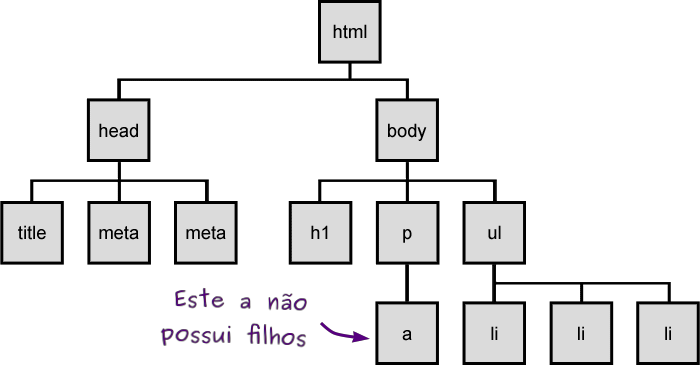
<figure class="figure-slides clean">
  <img src="..." class="figure-step bullet-no-anim contain">
  <img src="..." class="figure-step bullet-no-anim contain">
  <img src="..." class="figure-step bullet-no-anim contain">
  <img src="..." class="figure-step bullet-no-anim contain">
</figure>.figure-slidesmakes a carousel of.figure-steps- Use
.cleanif only the current image should be displayed
- Use
- Use
.bullet-no-animto avoid bulleting animation - Use
.containfor the images not to exceed the size
Environments
This is a .note.info and it only requires the class on a paragraph or list item.
.result of a computation in a <div> with a data-before="STHG" "label". .did-you-know section with some collateral information in a <div>. <p class="note info">
There is also a <code>.note.warning</code> ...
</p><div class="result" data-before="Result">
This presents the <code>.result</code> ...
</div><div class="did-you-know">
This shows a <code>.did-you-know</code> ...
</div>
Buttons, switches and badges
Bookmarklet button
Bookmarklets are actually links with JS code which we can add to the favorites bar
<a href="javascript:..." class="bookmarklet">
  Drag me to favorites
</a>
Switches
Just a more interesting style for checkboxes. It requires a checkbox with .switch followed by a properly configure <label>
<input type="checkbox"
              class="switch" id="sample">
<label for="sample">Sample switch</label>
Badges
Some badges with 2 different variations:
- .badge.type1
- .badge.type2
- .badge
Lists
.no-list-icon- Removes the bullets from list items
.horizontal-list- This is a
- horizontal list
- using flex box
.multi-column-list-{2-5}- item 1
- item 2
- item 3
- item 4
- item 5
- item 6
Layout: .layout-split-{2-5}
It is possible to split content in columns (using the flex class .layout-split-{2-5}. For example (.layout-split-3):
Paragraph 1
Paragraph 3
Paragraph 3
Layout: .code-split-{2,3}
To split code which is inside some parent (usually inside <li>) content in columns. Example with a <li class="code-split-3">:
This is code 1This is code 2This is code 3
Layout: .item-code-width-{image,result}
Make a list have a code and either an image or a .result to the right.
This is code 1
<p>This is code 1</p>This is code 2
<p>This is code 2</p>-
This is code 3
<p>This is code 3</p>
It can also be used with images instead of .results.
Layout: .card-list
Item 1

Item 2
Item 3

Item 4

Item 5

Item 1

Item 2

Item 3

Item 4

Item 5

The .card-list class turns a simple list into one with
a title (h1, h2, h3, h4, h5, h6, figcaption) and an image.
The second is using modifiers:
.polaroid- Adds a large white border
.title-top- Puts the title on top